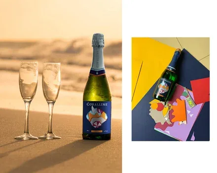

Sunny branding for Coralline sparkling wine
Dozens of in-depth interviews in several cities and a large-scale photo shoot – that is what lies behind the brand development for Coralline sparkling wine (Bosca-Rus). A lighthouse, seagulls and the sea.
Did we manage to convey the unique festive mood? You decide.
Bosca-Rus is a producer of champagne and sparkling wines based in Ufa. The main problem was that shoppers of the retail chain in which the product was listed simply did not see it on the shelf.
A traditionally shaped bottle and label designs without any bold contrasts or eye-catching accents meant the product remained unnoticed and little known to its audience.
The development of new packaging for the Coralline brand was the first step, based on the results of a comprehensive analysis of shopper preferences and behaviour in the sparkling wine drinks (carbonated wine beverages) segment.
The agency team conducted dozens of in-depth interviews in several benchmark cities and studied the company's business processes and market trends in Russia and abroad in order to understand the specifics of how this type of drink is consumed and the changes that have taken place since the category entered the market. The research resulted in a set of recommendations that included, among other things, new niches in the minds of target audience groups depending on the occasion and psychological characteristics. These niches became the basis for developing the packaging design for the products – both new and existing.
For a long time, the consumption of sparkling wine drinks was tied to champagne traditions, but growing experience of consuming this category has led to the emergence of a set of occasions that could potentially suit such a drink but are not yet reflected in either the design or the positioning. The choice of design direction was also influenced by the characteristics of the potential audience:
- Open to new things, willing to experiment with drinks;
- Trust foreign brands;
- Like the European lifestyle;
- Do not associate classic Russian champagne with a buffet reception or a small celebration;
- Cannot afford an expensive drink.
The synthesis of these materials resulted in the hypothesis that there is demand for a product reflecting a «European» (in the eyes of the Russian target audience) format of consuming a light, low-alcohol fruit-flavoured drink for picnics in the countryside, relaxing on the beach or an open-air buffet.
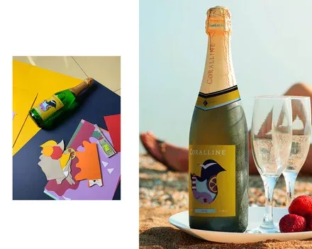
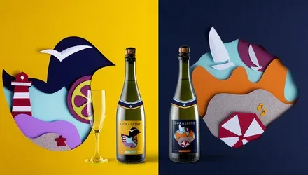
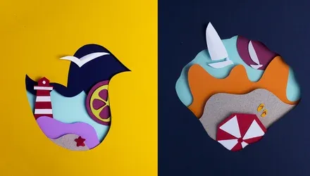
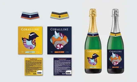
The visual image of the packaging includes the attributes of sunny romance: the sea, the beach, seagulls, citrus fruits, waves and sailing boats, which is ideal for the Coralline consumption occasion.
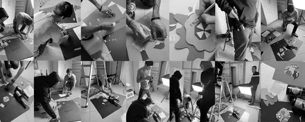
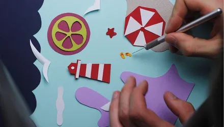
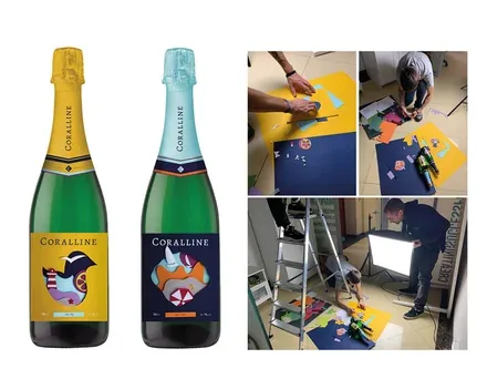
The original paper collage technique (paper sculpture), combined with an unusual neck label that references a sailor's uniform, emphasises the product's individuality, aids recognition and makes it stand out on the shelf. Every element was created and assembled by hand by the agency's creative team and brought together into a cohesive composition.