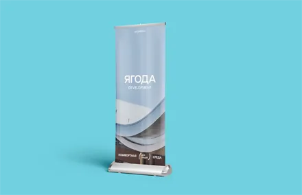

Yagoda Development. The image of a reliable developer
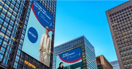
«My home is my castle». Everyone needs a home of their own. It gives a sense of comfort and safety. That is why real estate developers compete for the attention of potential customers. But people only notice bright, recognisable brands. We invite you to read our case study, where you will learn how we managed to bring such a developer brand to life!

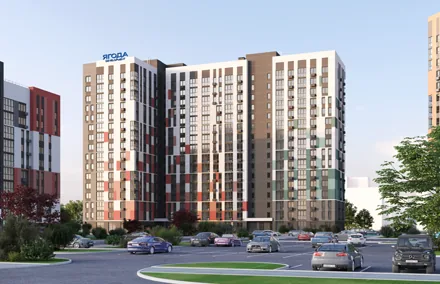
«Yagoda» is a modern real estate developer in Bryansk. The company entered the market a year and a half ago, but its experienced team has been working for more than 20 years. On 4 November 2022, the developer «Yagoda Development» was awarded the title of «Reliable Developer of Russia 2022».
«Yagoda» approached us with several tasks:
• To develop the corporate identity in order to strengthen the brand's identity and form the image of a reliable developer.
• To develop a communication strategy to focus on the target audience, increase reach and raise brand awareness.
• To create an advertising campaign idea, with visuals and slogans.
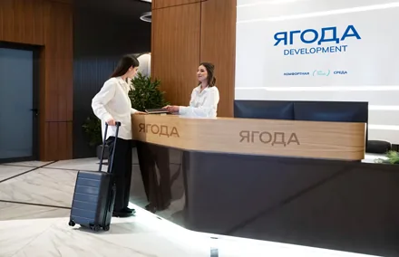
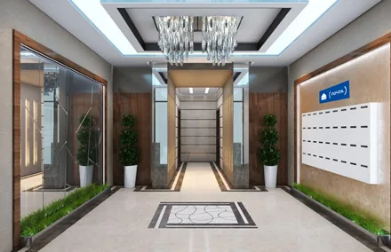
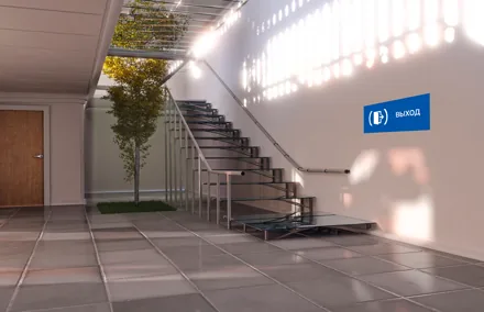
In the course of the analysis, the Brandson (TSN) team identified a number of problems:
• The developer «Yagoda» lacks a coherent, vivid positioning
• Communications had not been developed, so brand awareness turned out to be low
• The audience perceived the «Yagoda» brand as the name of a residential complex rather than a developer
• The situation on the competitive market is no better. No one can recall any advertising or catchy messages.
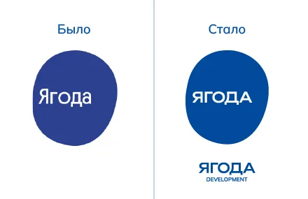
A great deal of work lay ahead in creating the strategy. We formed the main attributes of the brand's new «backbone»: scale, the developer's extensive experience and the number of completed projects. A new logo also had to be developed. The existing one conveyed softness, instability and shapelessness, which contradicts the audience's needs in unstable times.
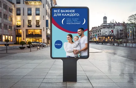
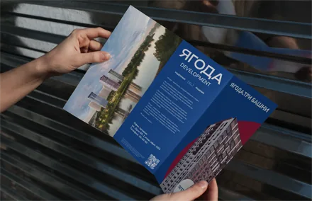
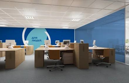
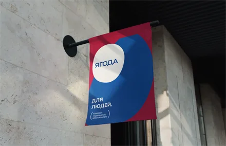
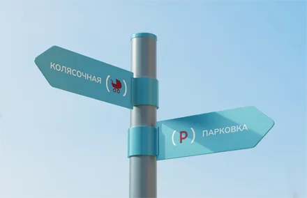
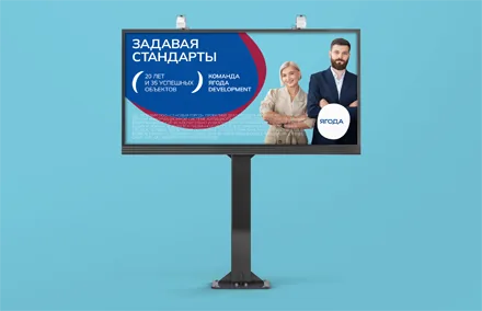
Brandson (TSN) strategists proposed that the brand create a communication ecosystem. «Yagoda» is a reliable developer in a time of tectonic change. The big idea of reliability is conveyed across all effective communication channels.
The positioning will be unified, but the way it is conveyed will differ depending on the target audience segment.
There was a need to give the image a sense of reliability and to reinforce in the audience's mind the fact that «Yagoda» is a developer, not just a residential complex.
That is why we recommended adding the descriptor “development” to the identity. To build a reliable image, we advised replacing the typeface inside the logo with a more solid one. We also recommended integrating the parent brand's name into the naming of the residential complexes in order to build a fully fledged branding system and, as a result, increase the developer's recognition.
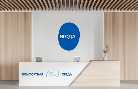
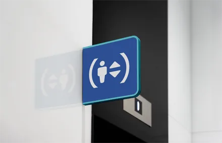
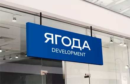
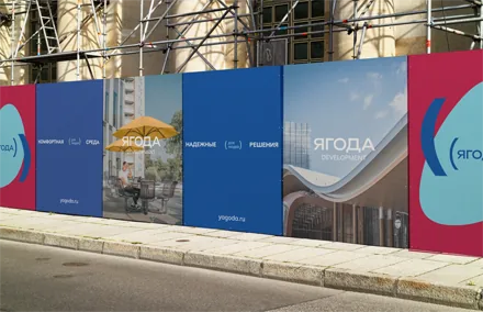
The new visual style, through the change of typeface and the introduction of a deeper shade of blue, conveys the solidity that was missing from the old logo.
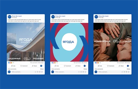
In communications, we developed the idea of people-centricity and thoughtfully designed projects that was built into the brand from the start. In this way we showed a focus on the audience's needs. In grammar, brackets are a clarification, an important addition to a sentence.
All of these are rules, and rules are about clarity and a systematic approach, which matter for a reliable developer . «Yagoda's» brackets contain everything customers need