
Wiener Wald Confectionery House in the Language of Joy
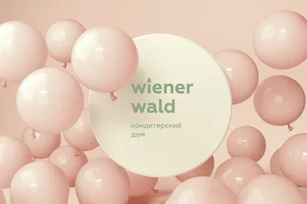
Wiener Wald is a brand from the city of Kemerovo; its partner retail network numbers 20 outlets in a city with a population of 550 thousand, and the product is also stocked by the city’s main retail chains.
The brand has long been loved by the city’s residents, but a new goal emerged: to bring it to the Novosibirsk market.
To this end, the Brandson team conducted large-scale research covering Russian and international trends in the confectionery market, the project’s competitive field and consumer behaviour.
In the project’s home city of Kemerovo the company is close to its maximum – its partner retail network numbers 20 outlets in a city with a population of 550,000, and the product is also stocked by the city’s main retail chains. There is room to expand the number of SKUs in the chains, but this measure will not bring a qualitative leap or growth. In this regard, the project’s ideologists set a course for scaling up the enormous accumulated experience of producing high-quality products with a superb taste honed over the years.
As part of the business scaling plan, the project was launched in Novosibirsk 5 years ago. But, lacking a clear brand concept in a city where the company does not have the long history of presence it enjoys in Kemerovo, the company faced difficulties in achieving its planned economic targets.
Another factor in favour of updating the brand was the increase in production capacity, which enables the company to reach a new level in the production and sale of its products, increase sales volumes and secure a return on investment.
The combination of these factors inspired the project’s ideologists to rethink the brand’s values and communications in order to create a new product, enter federal sales channels and achieve easy, financially successful scaling.
The main objective is to form a renewed brand identity in preparation for scaling. The company is 16 years old; much has changed over that time, and it is necessary to rethink the experience gained and formalise the company’s values in order to communicate them effectively both to the outside world and within the company.
The team was also tasked with developing specific visual and verbal means of conveying the renewed meanings: changing the brand platform and visual style across all touchpoints – packaging, the company’s own retail outlets, POS materials and digital.
Growth in brand awareness and loyalty (relevant for Novosibirsk) and, as a result, growth in sales volume.

The Brandson team conducted large-scale research covering Russian and international trends in the confectionery market, the project’s competitive field and consumer behaviour.
Trends show that sweets remain a stress reliever: 42% of Russians want to “treat themselves to something tasty more often”. Consumers respond far more actively to themes of safety and want to reward themselves for the stress they have endured.
At the same time, a sharp rise in online sales of sweets was recorded during the pandemic. In some chains, online sales in the “confectionery” and cakes and pastries categories grew by up to 76% over 2020.
It can therefore be concluded that cakes act as a trigger for relieving emotional tension and should have a modern corporate identity that is well integrated and optimised for digital channels, not just for retail shelves.
Analysis of the local market revealed the following phenomena:
Buying out of habit. One source of Wiener Wald’s leadership is the conservatism of a portion of consumers whose taste has been shaped by the long-standing quality and variety of the company’s products, in which the company had no equal in the past. Another portion, however, is subject to erosion amid growing competition. This clearly points to the necessity and importance of updating the brand.
It is also worth noting the dual image of the WW brand. On the one hand, Wiener Wald is something stable, familiar and always interesting thanks to the constant renewal of its range. On the other hand, customers have an unmet need for global change: to try not only a new flavour but also a new brand. So it is fair to speak of a demand for a new or renewed image.
Analysis of the target audience showed that its core has a “traditionalist” psychological profile. People with average and above-average incomes. They perceive fine confectionery as an attribute of a special occasion. For them, warm family relationships and home comfort are the antithesis of an unfavourable environment. They value well-established brands and have a broad and diverse consumer profile, which points to the need for universal symbols and images.
Competitive analysis revealed a vacant niche in the “Festive + Caring” segment, which is unoccupied in Novosibirsk and, in Kemerovo, is represented only by an imitator brand. Moreover, in Novosibirsk the “festive atmosphere” inherent to the brand is promoted by confectioners only as a secondary message – after “a premium ice cream range” or “host a tea party at home”. To stand apart from competitors, the brand should also communicate care – both for customers and for their loved ones.


The specific nature of the category’s perception is that a cake is, above all, an attribute of celebration. This proposition is simultaneously the source of the driver “have a celebration, lift the mood” and of the barrier “not every day – every day can’t be a celebration, just in case” in consumption.
An alternative view of the category was therefore needed, taking the established perception into account – not a complete rethink along the lines of “cake is the healthiest food”, but an additional angle: “yes, cake is for celebrations, but it is the kind of celebratory detail that is appropriate more often, because…”.
In Kemerovo the product is perceived as “the only possible one”, but most often exclusively in the context of an event. “Festive” positioning encourages an attachment to stereotypical holidays, their storyline and rituals, whereas an increase in consumption frequency is possible through the use of adjacent meanings that appeal to a "celebration in the heart".
Since a niche for a caring and festive brand had been identified, the positioning was premised on rethinking three semantic fields: warm attitude, festive mood and joy.
It was decided to position Wiener Wald as a means of mastering the language of joy.
Savouring a favourite dessert, we feel joy and share it with those around us. There is no need to wait for a formal occasion in the calendar: every day can become a celebration, and every impression unique, when you know how to feel and express joy in all its shades. Wiener Wald will teach you this.
Any language is a changing system that generates new meanings, which is why making cakes for Wiener Wald is a creative process of constantly creating novelties and searching for fresh solutions.
Wiener Wald as a tool for harmonising life:
- Sets the tone for a joyful and harmonious life, revealing joy in its details and shades;
- Radiates warmth and calm in contrast to an unfriendly or routine external environment;
- Teaches all the shades of a festive mood and invites you to share it with those close to you.


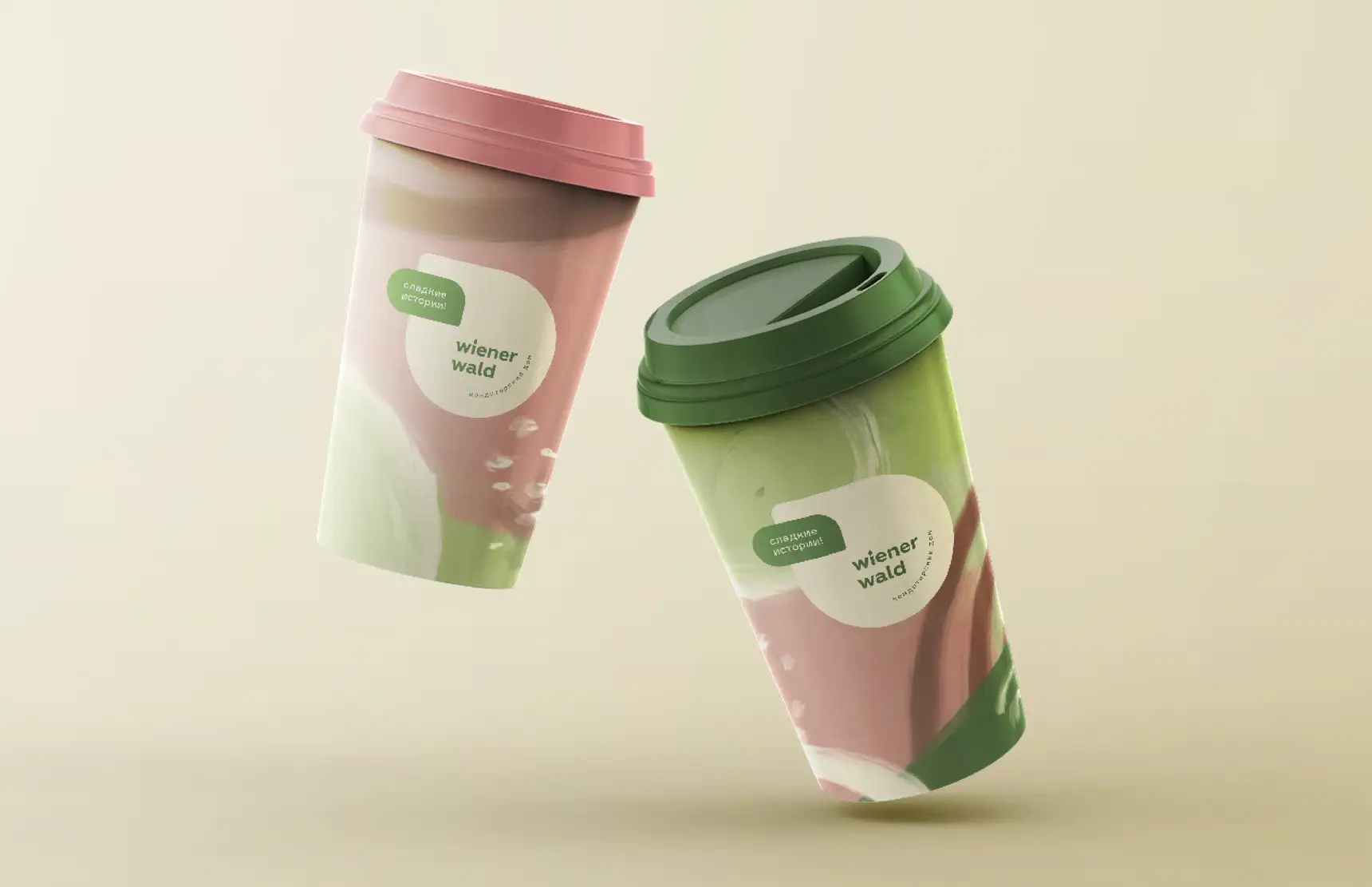
The brandline “Sweet Stories!” presents every dessert as a captivating story with a unique plot, written in its own language of joy.
Wiener Wald is a multicultural centre of the language of joy. Vienna is the capital of joy. It has been home to philosophers and psychologists, musicians and artists and, of course, confectioners who explored its shades.
Like a true collector, Vienna has gathered all forms of joy. Wiener Wald does the same in Russian cities: the brand collects the best and most joyful things – not only from Vienna but from all over the world.
The language of joy is not a grammatical structure or a dictionary of holiday greetings. It is life itself in its warmest and most magical moments, described by the writer’s pen, the musician’s bow and the artist’s brush.
Wiener Wald cakes are the product of the sensitivity and refined taste of a creator capable of capturing and expressing the subtlest shades of joy on a culinary canvas. The light of a festive candle and the figurative language of the storyteller make up the spirit of celebration at every table.
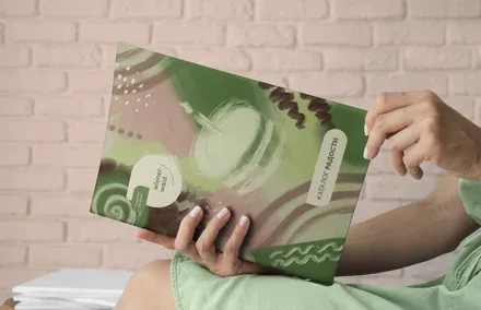
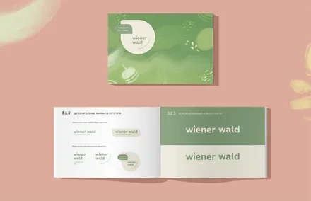
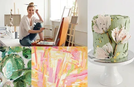
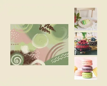
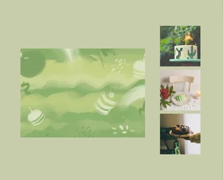
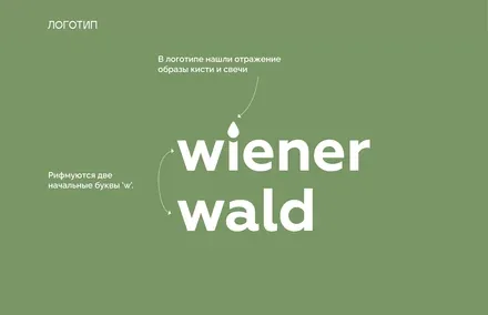
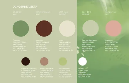
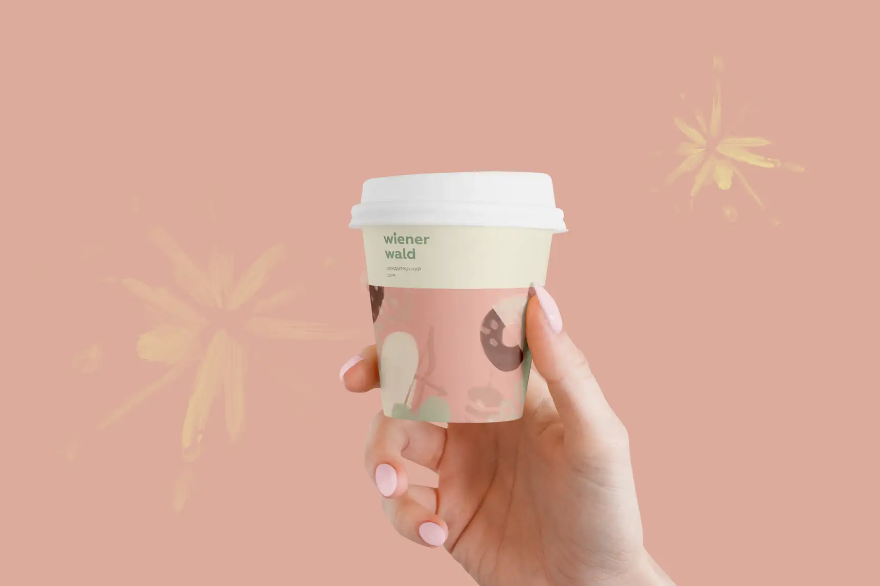
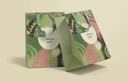
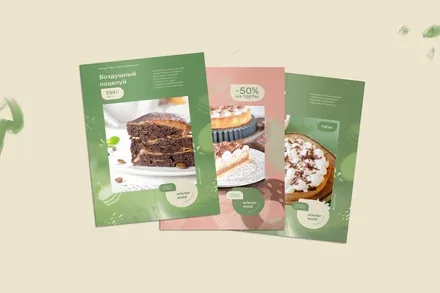
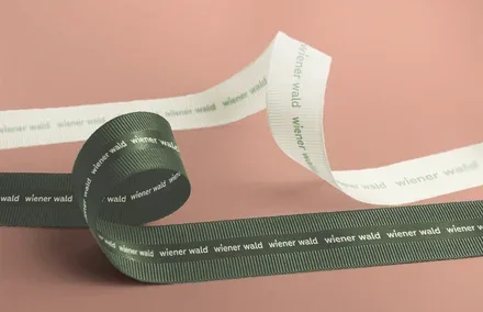
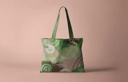
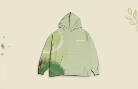
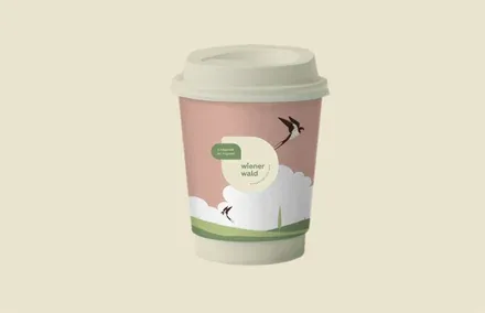
The brand identity we developed immerses the audience in a world of creativity. The logo, reminiscent of a book title, reflects the images of a brush and a candle, and elegantly rhymes the two letters w. The brushstrokes that make up the corporate identity look as if they were made with a cake spatula, while the delicate food-inspired tones of the colour palette speak of the producer’s refined taste and the naturalness of the product.