
Carelica spa complex brand for the Hilton hotel

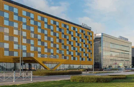
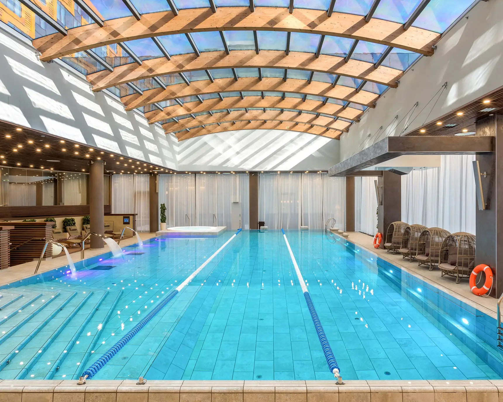
The Hilton Saint Petersburg hotel is the first Hilton Hotels & Resorts property in the North-West region of Russia. The hotel is part of the ExpoForum convention and exhibition centre, the most modern venue in Europe and Russia for business and entertainment events of any scale and format: exhibitions, congresses, forums, sporting and cultural events. The same building as the hotel houses a new spa centre that brings together the full range of modern care and relaxation treatments.
The Hilton Saint Petersburg hotel is the first Hilton Hotels & Resorts property in the North-West region of Russia. The hotel is part of the ExpoForum convention and exhibition centre, the most modern venue in Europe and Russia for business and entertainment events of any scale and format: exhibitions, congresses, forums, sporting and cultural events. The same building as the hotel houses a new spa centre that brings together the full range of modern care and relaxation treatments.
The Brandson team needed to create a cost-effective brand for the spa complex, capable of conveying the property's key advantages and building a unique image of the project in the minds of both foreign and Russian consumers.

In the course of preliminary research, the project working group identified the key vision of the project's ideologists and experts, studied the specifics of consumption of these services in relation to the complex's location, and summarised the main functional advantages of the spa complex, which formed the basis of the brand platform:
— a variety of modern care treatments;
— a wide range of traditional ethnic spas and bathhouses;
— the ability to offer guests cosmetic products based on regional organic ingredients;
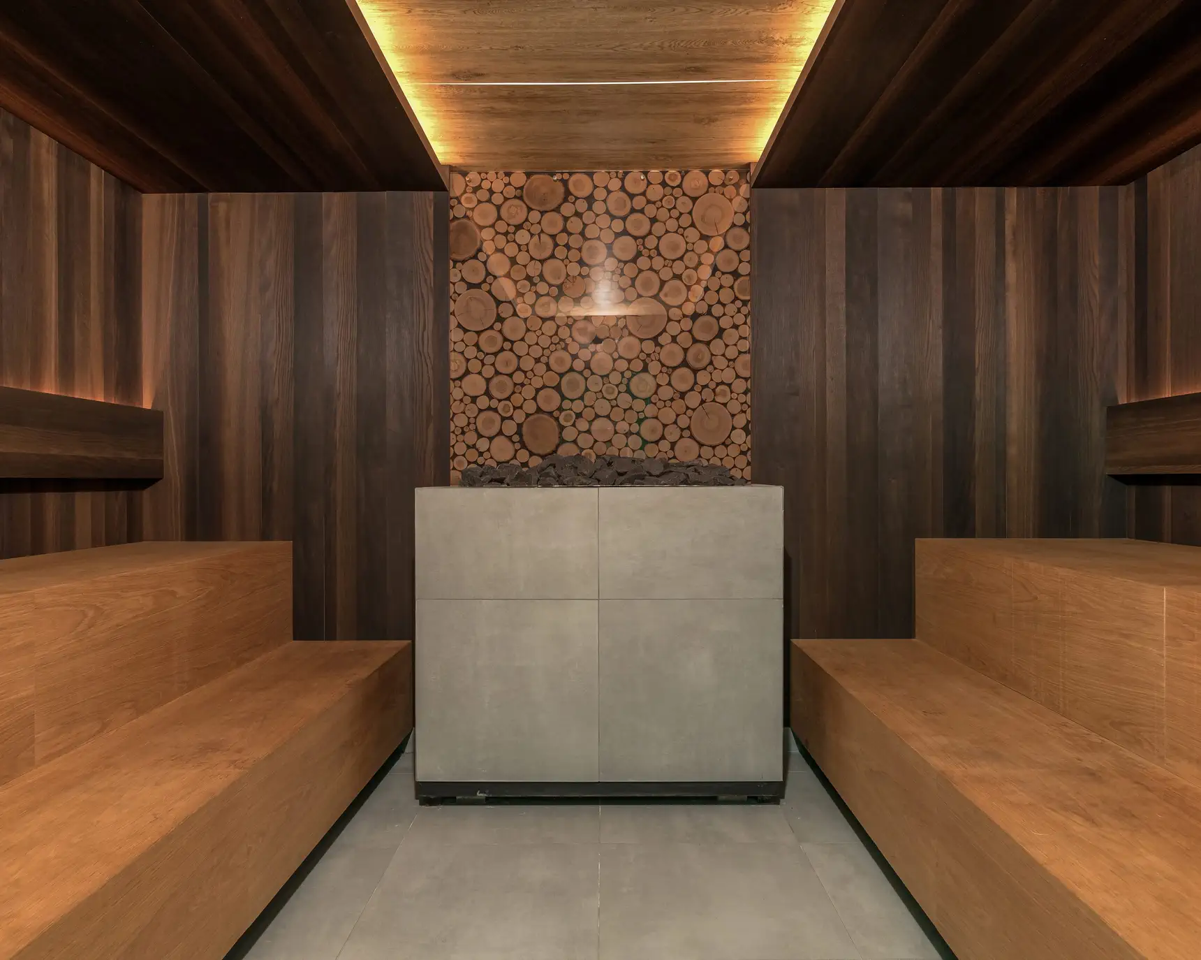
— modern ECO-style interiors with carefully crafted details that create the atmosphere of northern nature;
— a convenient "in-between" location: the hotel, the exhibition centre, proximity to the tourist centres of the Leningrad Region and the airport.
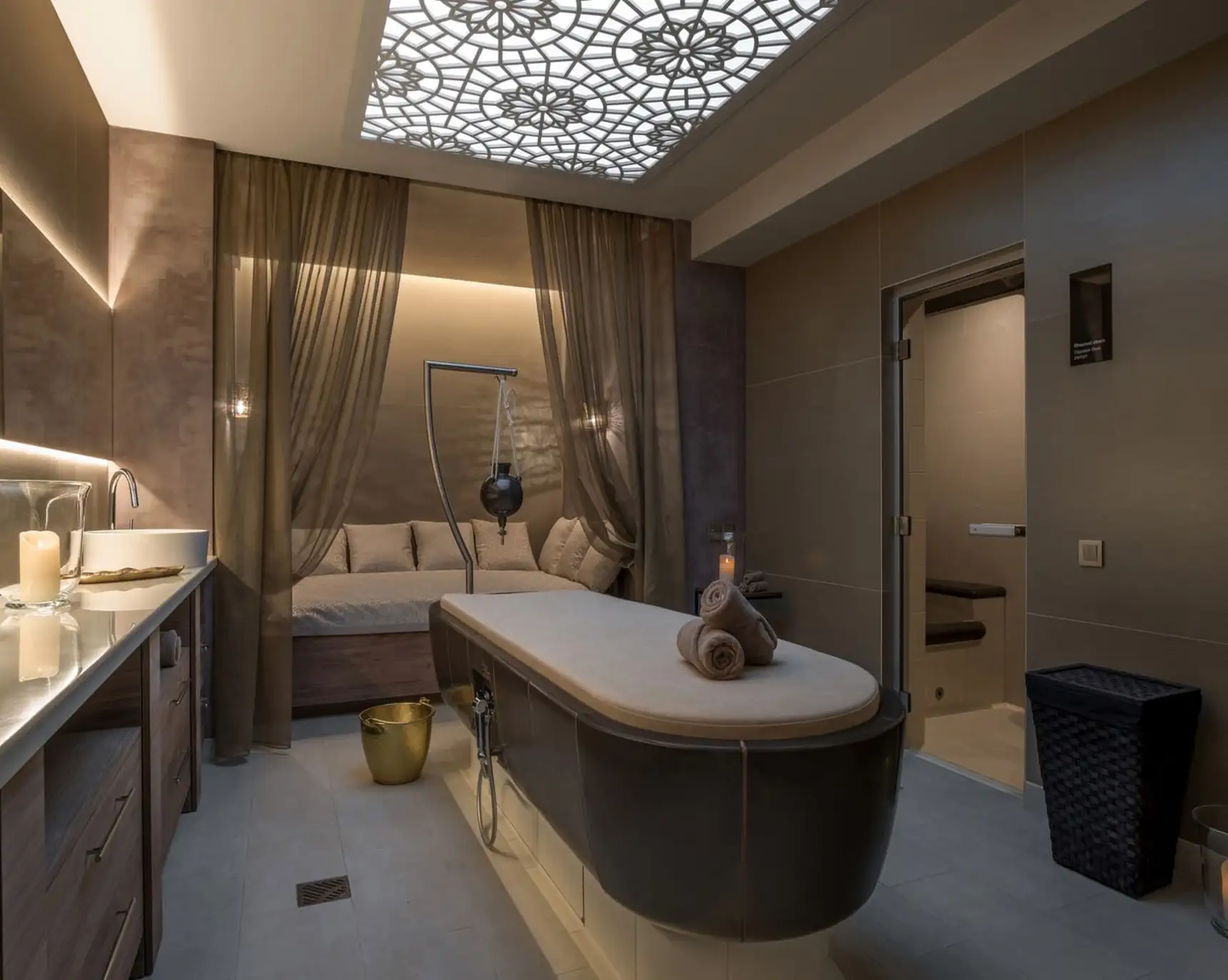
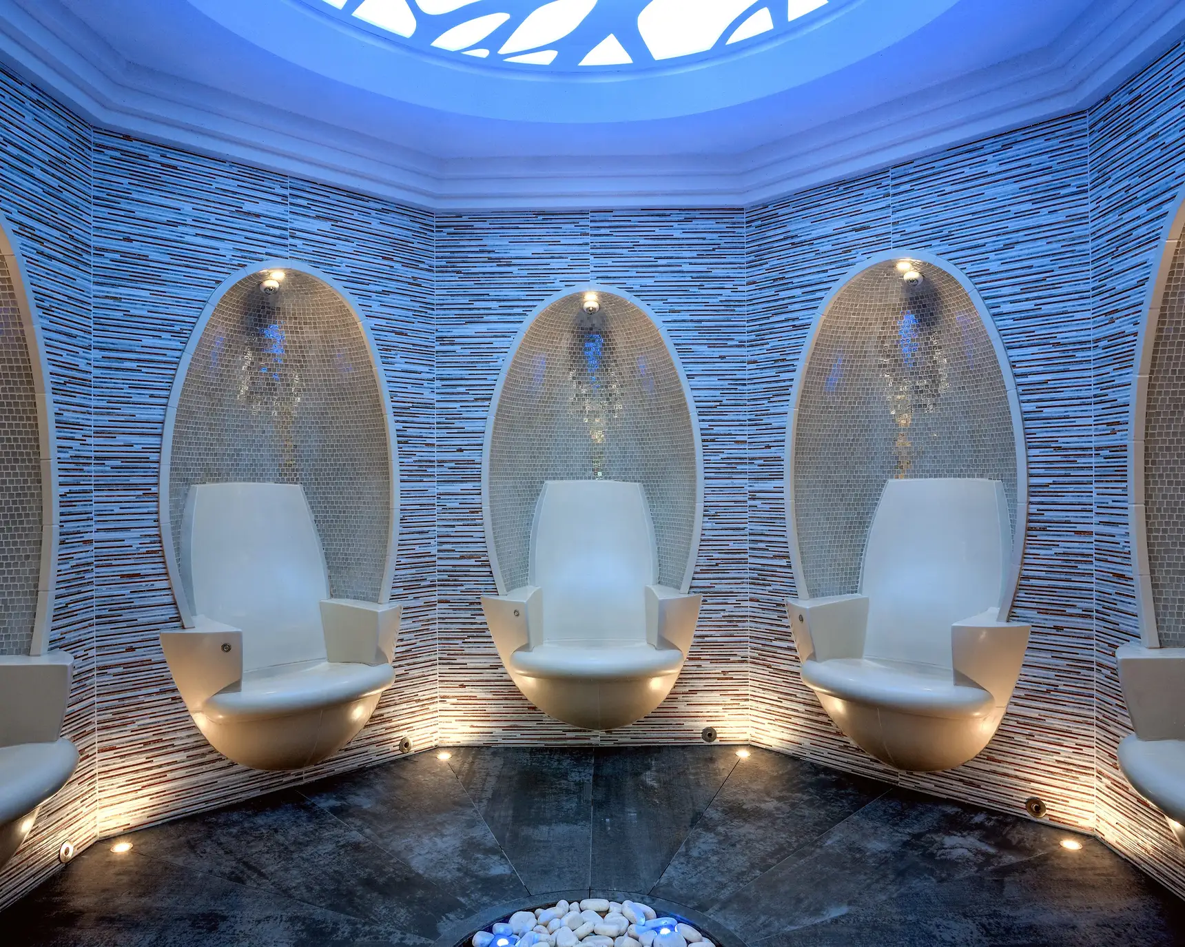
Based on the complex's key functional features, the agency's specialists created a brand platform built on a balance between a global approach to health and a local "twist" that would stay in the memory and make the brand stand out vividly from its competitive environment.
In short, it goes like this: "We draw on the full range of progressive wellness technologies and global knowledge about health, while at the same time using beneficial substances and methods of local origin that appeal both to foreign tourists and to local guests who appreciate the benefits of cosmetics based on elements of their native nature".
The combination of the traditional and the modern correlates perfectly with the concept of "ecological consciousness", since this term conveys a deep spiritual understanding of the inseparable bond between humans and nature, while at the same time allowing the conscious use of scientific achievements as long as they are safe for health.
The presence of a notional "spiritual" element means that this is a complex where you can not only relax and improve your health, but also gain new knowledge about how to maintain the natural balance of body, mind and spirit.
Beyond the functional advantages, the aesthetic component is of great importance, which in our case is linked to the presence of eco motifs in the verbal and visual components of the brand. As a result, the brand positioning in this context reads as "The spa centre of ecological consciousness", or, as a descriptor, ECO SPA.



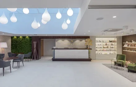
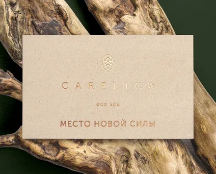
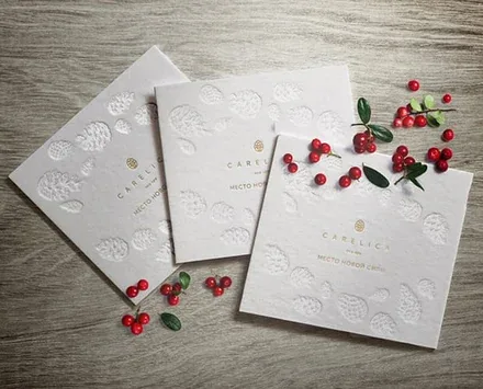
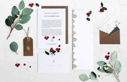
Based on the established platform and positioning, and taking into account the elements already integrated into the interior (a "northern" colour palette, textured stone, wood, moss, pebbles), a corporate identity was developed, inspired by the serene atmosphere of untouched corners of Karelia.
The nature of Karelia was chosen not only because of its geographical proximity and its fit with the interior solutions. Above all, it is a unique point of attraction for domestic and foreign tourists, and therefore the essential aesthetic component of local origin that can give the brand individuality and charm.
The name is formed from a combination of the words "care" and "relic" (a keepsake, a memory; figuratively, something "dear and familiar"). It is also a partial reference to the famous Karelian birch, betula carelica. This name perfectly conveys the elegance and individuality characteristic of exclusive works of applied art made from Karelian birch wood.
The word "care" points directly to customer focus and the value of caring for the consumer. The multiple meanings of the word "relic" neatly play on the tourist's opportunity to take away an unforgettable memory of a trip to St. Petersburg, a city that becomes close and familiar thanks to its healing natural potential. The brand line "A place of new strength" plays on the brand's territorial anchoring while also carrying the idea of renewal and replenishing one's energy.
The brand's visual attributes match its character:
Ecological: the use of natural colours, textures and materials;
Individual: illustrations hand-drawn by the project's designers;
Elegant: a presentation style geared towards the "business" and "premium" segments.