
Branding for the sunny Ivolga boulevard
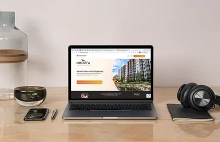
The Ivolga residential complex is a meeting place for two people in love, full of joy, lightness and comfort.
The new residential complex project cements Barents Group’s leading position in the Petrozavodsk real estate market and gives a complete picture of the company’s capabilities. It is not just a building but a fully-fledged urban space, created with the needs of the modern city dweller in mind. Housing like this will create a social environment of like-minded young people and allow residents to discover themselves as genuine, self-assured family people. It is a platform for a new life.
“Barents Group” is one of the leading real estate developers in the Karelia and Petrozavodsk market, operating successfully since 1997. Since 2009, in order to introduce unified management principles and increase capitalisation and operational efficiency, it has been part of the holding of the same name, whose enterprises operate in a wide range of economic sectors. Its highest-priority activity is the construction and sale of real estate and apartments in Petrozavodsk.
The developer plans to build a modern, high-quality panel building in the very heart of the Drevlyanka residential district of Petrozavodsk, using technologies ideally suited to northern conditions: low heat loss, excellent sound insulation, well-thought-out layouts, underfloor heating distribution (no heating risers), video surveillance and security, and pram storage rooms on every floor. The building is perfect for families with children, as it is located in the centre of a residential area with established infrastructure.


An analysis of the competitive landscape revealed an absence of meaningful strategic, visual and verbal solutions that could stand out vividly against the multitude of projects being built in the city. This gave us the freedom to choose our approach to building the brand platform and its identity without having to work around niches already occupied in the consumer’s mind.
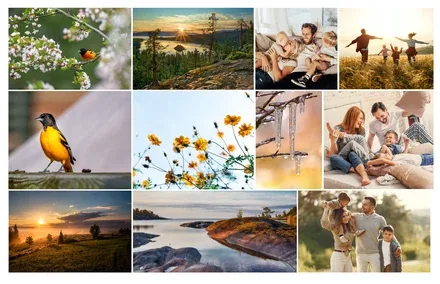
The core target audience of the project is young people. Young families are actively interested in housing in a cosy, well-developed neighbourhood where life is always pulsing, lights are on, cars are driving by and people are strolling and laughing. Today’s young people prefer socialising with like-minded people and an active lifestyle; they are devoted to their children and honour family values – love, loyalty, care and the desire to achieve more for their loved ones. They are fans of outdoor activities and travel.
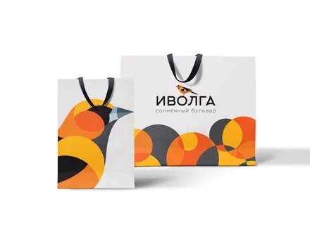
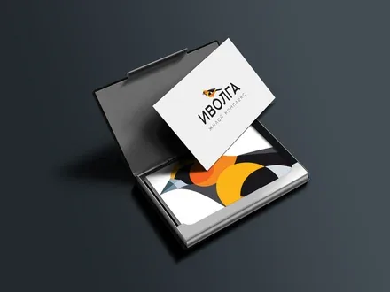


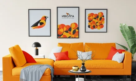
The point is that the all-encompassing Lover archetype was chosen for the project – the archetype that governs all forms of human love, from parental love to friendship, from love of one’s homeland to romantic relationships. This decision reflects the company’s approach to communication most harmoniously and allows the brand to be charged with bright, sunny energy in contrast to the cold restraint of Karelia’s traditional “northern style”. It also aligns with the values of the target audience.
The new residential complex project cements Barents Group’s leading position in the real estate market and gives a complete picture of the company’s capabilities. It is not just a building but a fully-fledged urban space, created with the needs of the modern city dweller in mind. Housing like this will create a social environment of like-minded young people and allow residents to discover themselves as genuine, self-assured family people. It is a platform for a new life.
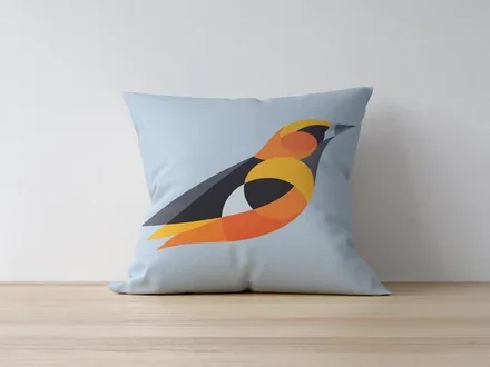
In the stillness of a summer evening, when the warm rays of the sun gently touch the ground, the melodic whistle of the oriole – reminiscent of a flute – can be heard from afar. These small, bright birds are a treasure of northern nature. They flit swiftly among the branches, live in pairs, look after one another and build their nest together, sharing the duties.
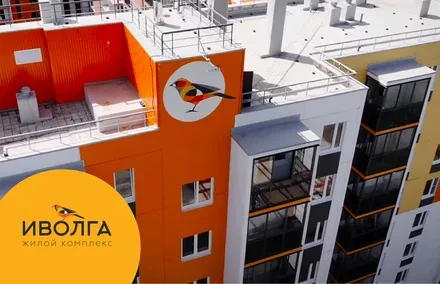
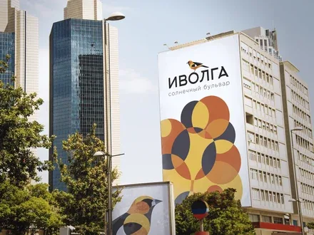
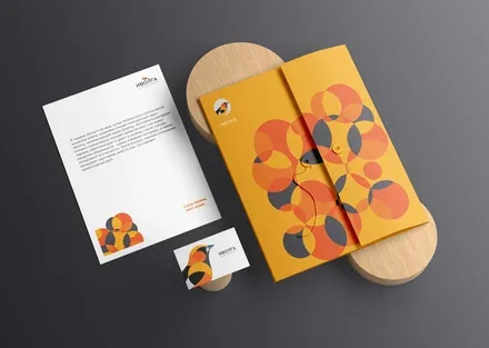
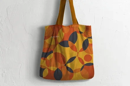
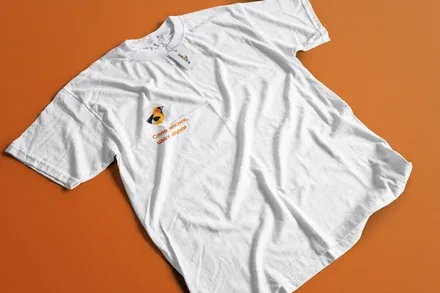
The identity and corporate identity of the new brand are executed in bright, contrasting colours that echo the oriole’s natural plumage. The circle, which became the basis for the brand patterns, conveys softness, comfort and care, and also makes it possible to construct a variety of design elements for subsequent adaptation to brand touchpoints. It is a glint of sunlight shimmering through the foliage, a freshly cut tree trunk, and an abstract element that recalls the aesthetics of the avant-garde, which underpins the modern approach to design.
The brand line emphasises the energy-filled image of the brand, focused on living every precious moment directly and actively. At the same time, it also embodies an inner value created through developed ethical qualities such as empathy and a sense of duty. The colour expresses the essence of the brand without words, through direct understanding that works on a physiological level.